UFT Election Turnout: Four Charts
Let’s dive into the UFT election results. Let’s start with turnout. (For the beginning of the analysis, click here)
Votes Cast tells us more than Turnout Percentage
Turnout Percentage
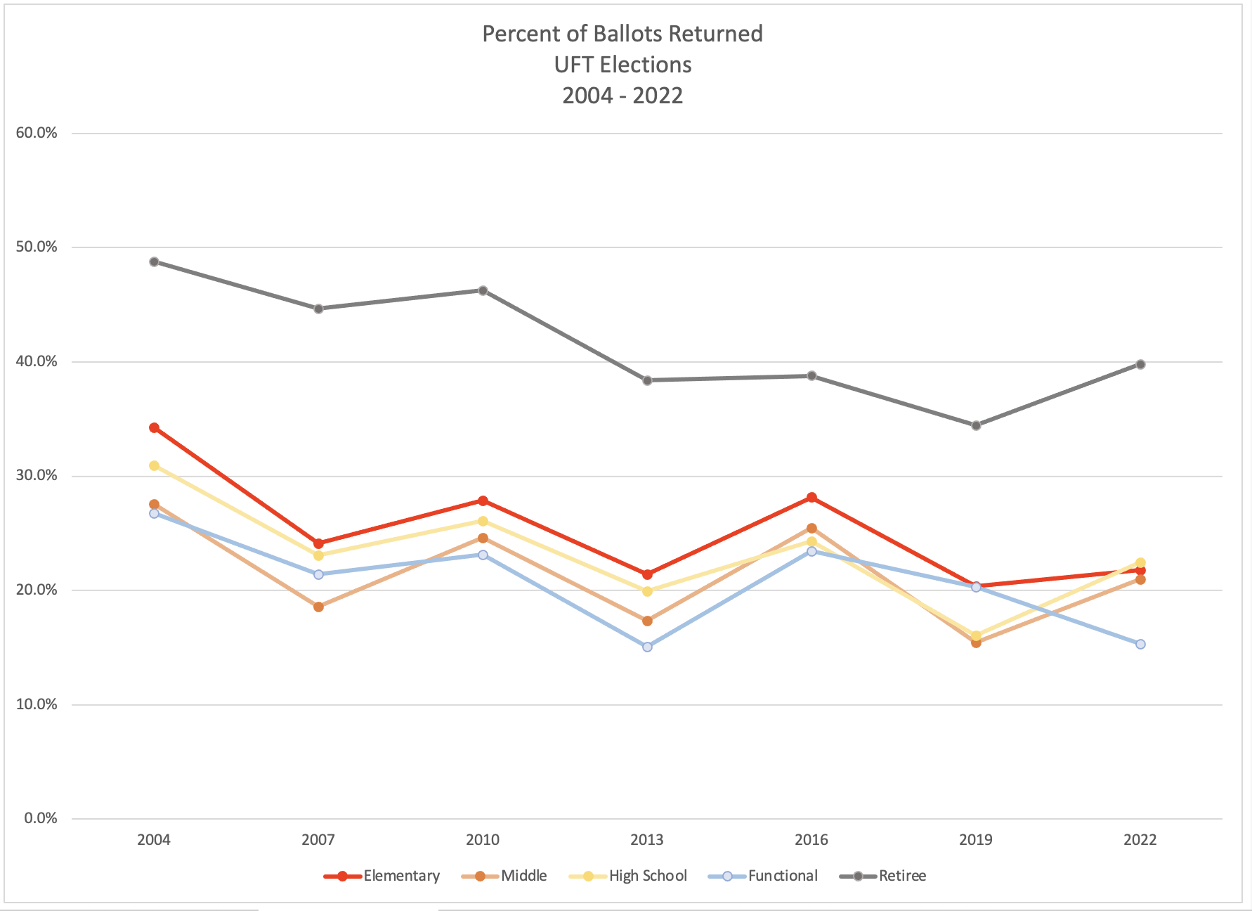
Turnout in all divisions is under 50%. And turnout has generally been falling in all divisions.
All divisions tend to move together. 2004, 2010, 2016 and 2022 were better years. 2007, 2013, and 2019 were lower. But the longterm slide is such that 2022, a better year, is not actually better than 2007, a bad year.
The rates move, more or less, together. Which makes 3 exceptions stand out:
- Retirees stand out for having a higher participation rate in general. And this year the rate among retirees. rose to better than the last three elections.
- In-service rates were moving together, mostly. But functional did not fall off much from 2016 to 2019, and then fell off noticeably from 2019 to 2022, while other rates were rising.
- Unexpectedly, elementary turnout did not rise this year in parallel with Middle School and High School.
Ballots Mailed
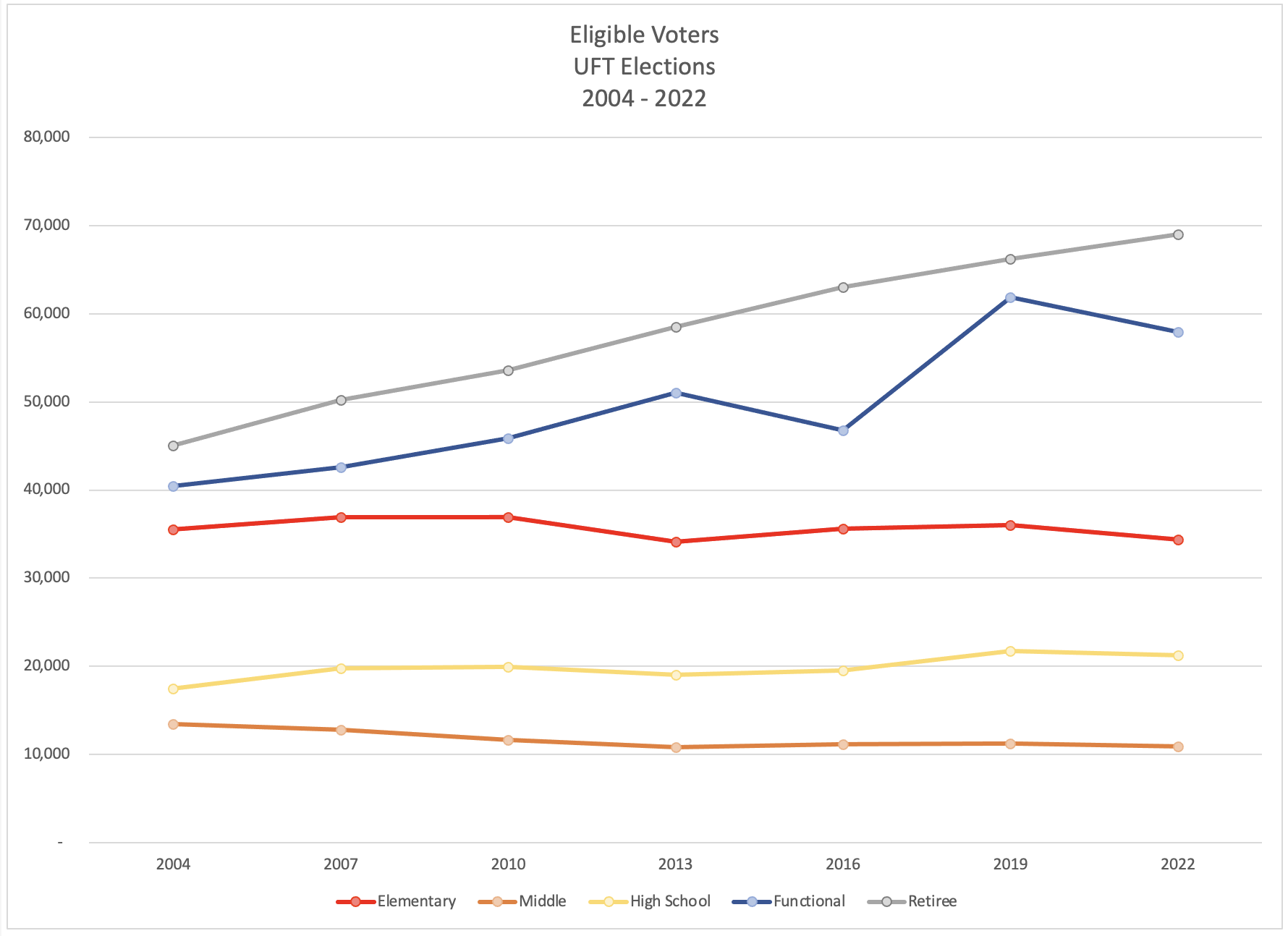
The number of retirees keeps going up! So the drops in percentage turnout are not as meaningful. And the RISE in percentage this year, even when the number of retirees was going up, means a lot of new voters. We will look at raw numbers of votes next.
The number of Middle School voters seems to shrink slightly. I’m guessing that’s due to teachers in K-8 and 6-12 being categorized as Elementary and High School, respectively. The middle schools are being squeezed.
The number of functionals has been rising, as we have adding categories or expanding categories of workers represented by the UFT. I don’t know why there is that blip in 2016.
This is the least interesting of the four charts.
Votes Cast
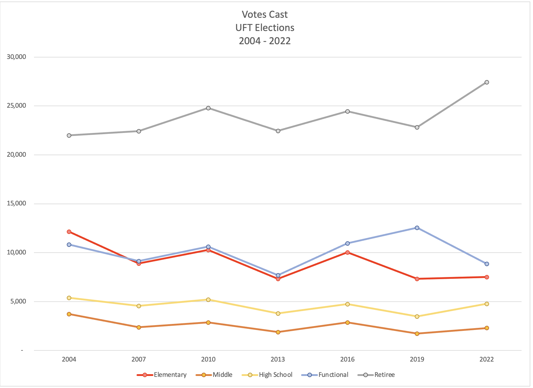
Middle School and High School move, just slightly, and together. The overall trend is down, but slightly.
- Elementary moves in a more dramatic fashion, and has fallen further. The lack of rebound from 2019 is startling.
- Retirees are not part of the same trends. Yes, there is a little motion up and down, in synch with MS/HS. But unlike any other division, the overall trend is for more votes from retirees, not fewer.
- Also, the jump in retiree votes this time stands out – it is a “thing” independent of anything else in this chart.
Functional votes stopped tracking elementary votes when we added new titles.
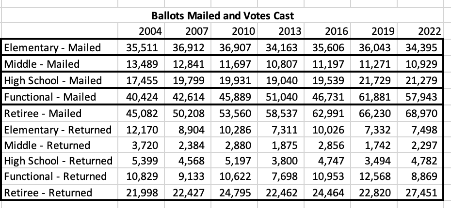
Putting Ballots Mailed and Votes Cast on one chart
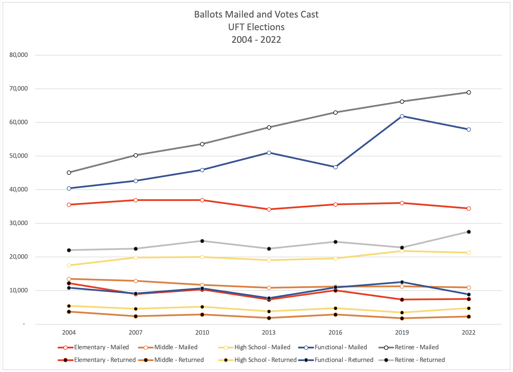
There is not obvious correlation. It looks like the votes move together year to year, independent of the number of ballots that were mailed. That suggests we should focus on votes cast, rather than on turnout percentage.
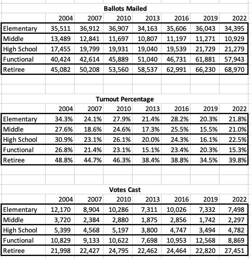
Data
Here’s what I used to create these charts:
As always, comments and corrections are welcome.


Trackbacks